DNV-GL
An oracle for maritime standards.
Introduction
DNV-GL provides a range of services within the segments of classification and advisory to maritime, oil & gas, energy and business markets. With the fusion of DNV and GL, two giants of the their market, the company wanted to standardize one of their most visited websites: the library of rules and standards, accessed by hundreds of thousands of people every day.
The Challenge
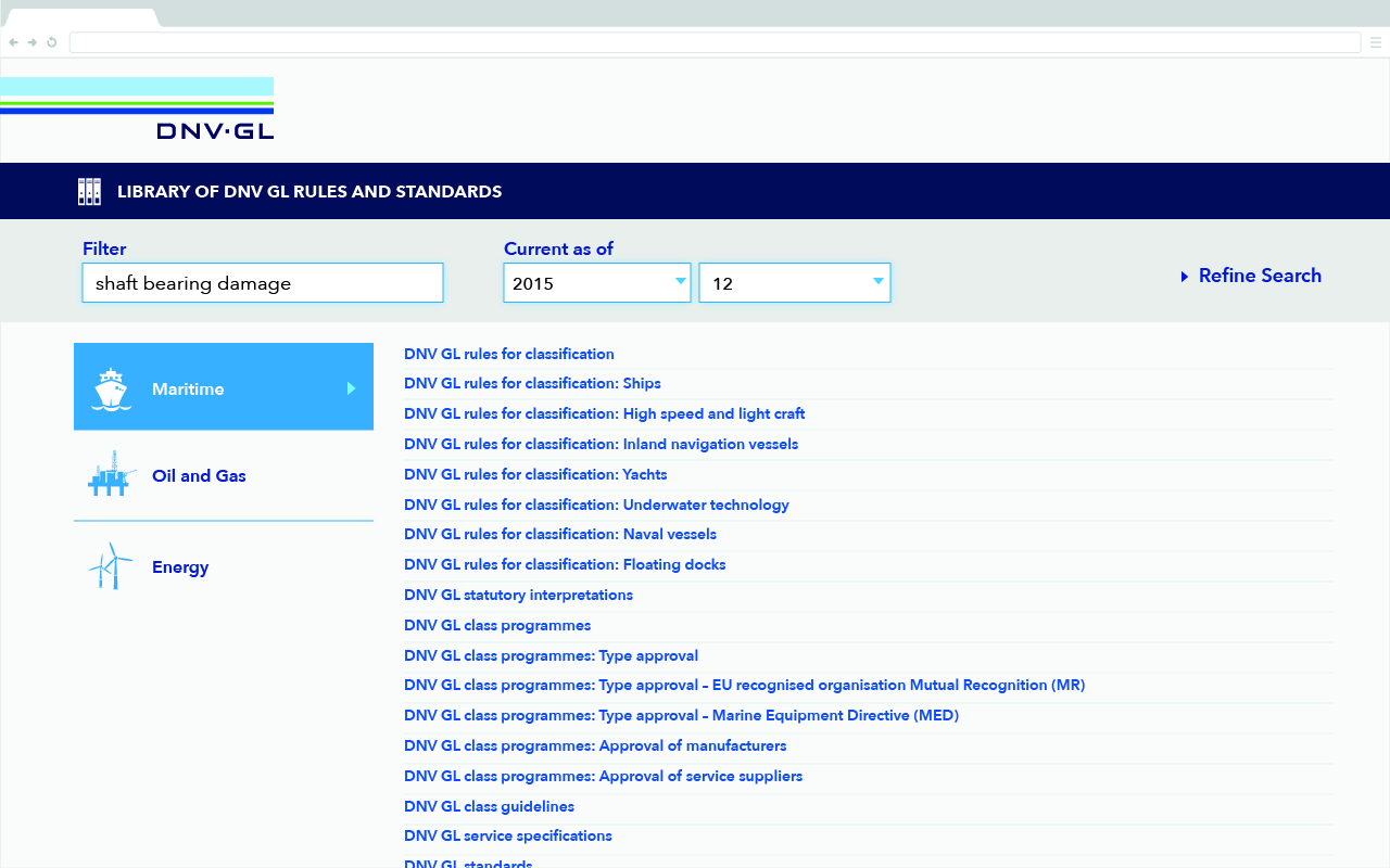
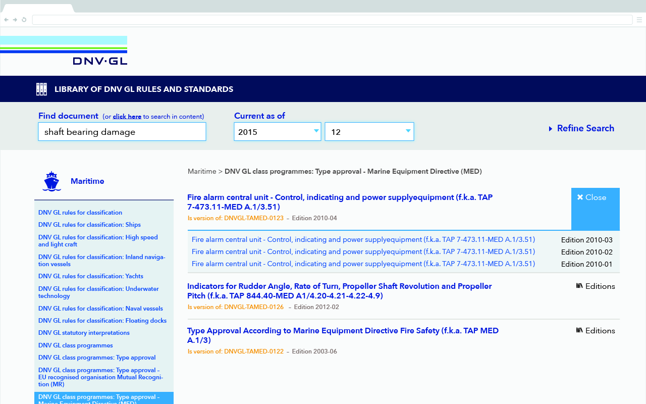
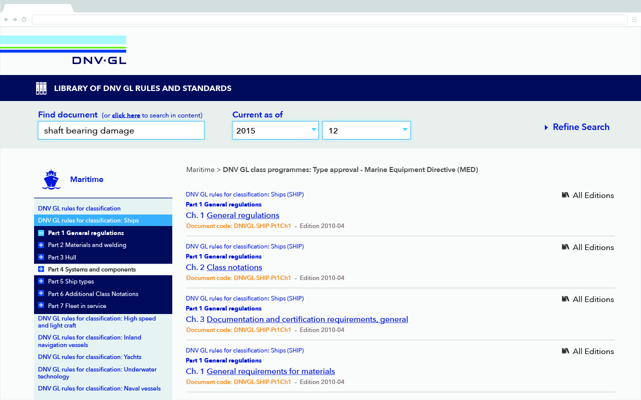
The different websites were not responsive, slow and hard to browse, but offered a wide variety of regulation documents for the manufacturing of vessels, turbines, pipelines and many other things.
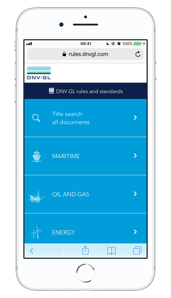
For the relaunch, we had to reformulate the whole architecture and code language. Navigating and finding documents had to be easy and fast, prioritizing mobile users and complying strictly with the company's branding guidelines.
The Challenge
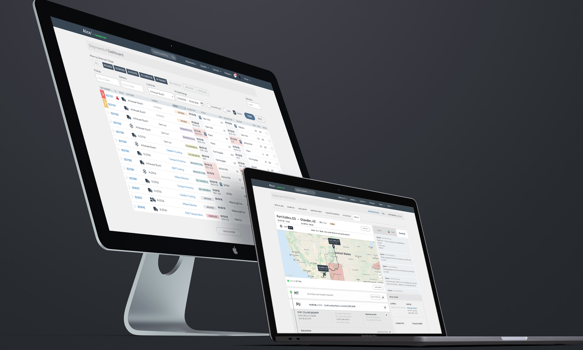
Alice is a set of tools that is used throughout all departments of the company, from sales to accounting. Each tool is seen as separate product that shares components and functionalities with others in the platform ecosystem. Designing solutions for the platform requires a holistic perspective of the functions and a special care with the design system.
With the sudden growth of Loadsmart, several products had to be scaled for larger operations while new and smarter solutions designed from scratch and added to the platform.
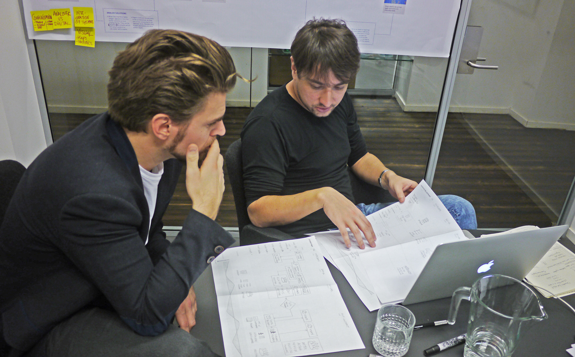
My Role
Participating in the project since the capture of requirements, I was responsible for making the bridge between UX design and front-end development for a speed delivery. On one side making the research, sketching ideas, defining the usability and flow, creating the icons and adapting the branding. On the other, validating solutions, discussing possibilities, prototyping and helping with the behavior of components.
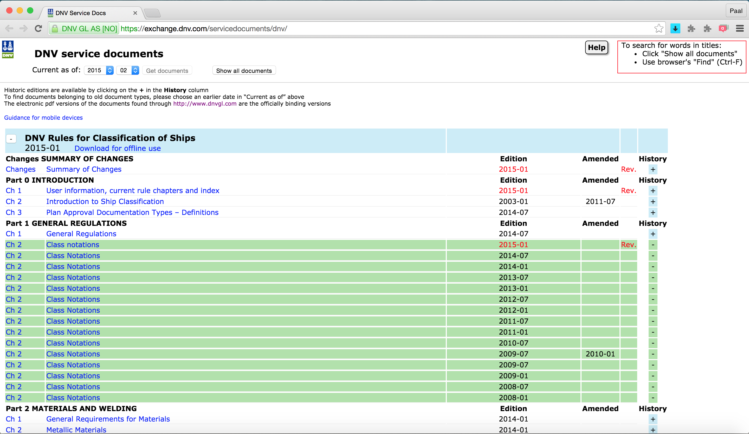
BEFORE
The previous design had a very basic table structure aligned to the left, with unclear hierarchy and lots of wasted space. Basic colors were used to define links, revised editions and sub-folders.
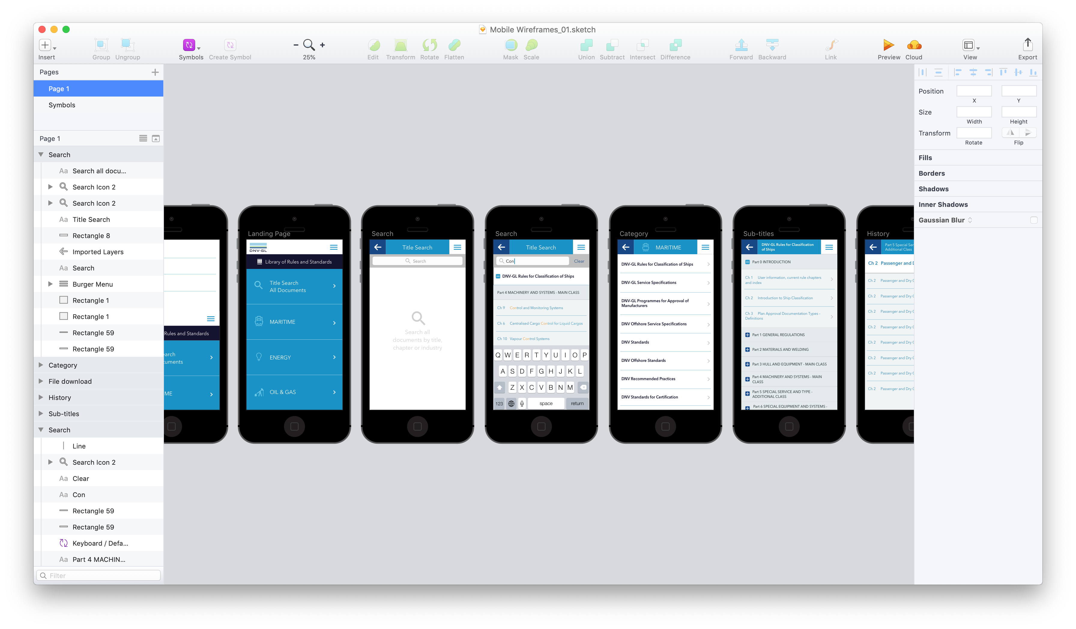
CONCEPT AND DESIGN
After following a concept of mobile first, I proceeded to sketch ideas and make wireframes of a simple flow for the interface.
Takeaways
Designing for mobile first is a good exercize for reimagining the architecture of a website, specially when no content can be removed from the smaller screen. When such a big tree of information has to be presented, navigation and speed become keys for a smooth user experience. In this case, working with a talented group of front and back-end developers has dramatically reduced the time of browsing in each page.
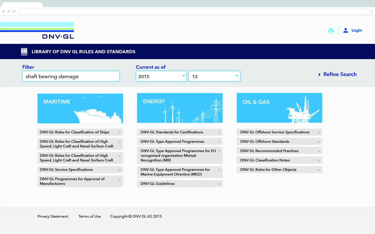
As of today, almost 4 years later, the same design continues to be used since the project was delivered in March 2015.
Takeaways
Designing for mobile first is a good exercize for reimagining the architecture of a website, specially when no content can be removed from the smaller screen. When such a big tree of information has to be presented, navigation and speed become keys for a smooth user experience. In this case, working with a talented group of front and back-end developers has dramatically reduced the time of browsing in each page.
As of today, almost 4 years later, the same design continues to be used since the project was delivered in March 2015.
Other Projects
🔓 AliceThe technology behind a freight logistics service
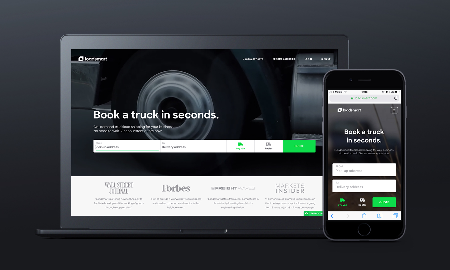
LoadsmartA design made to disrupt truckload shipping
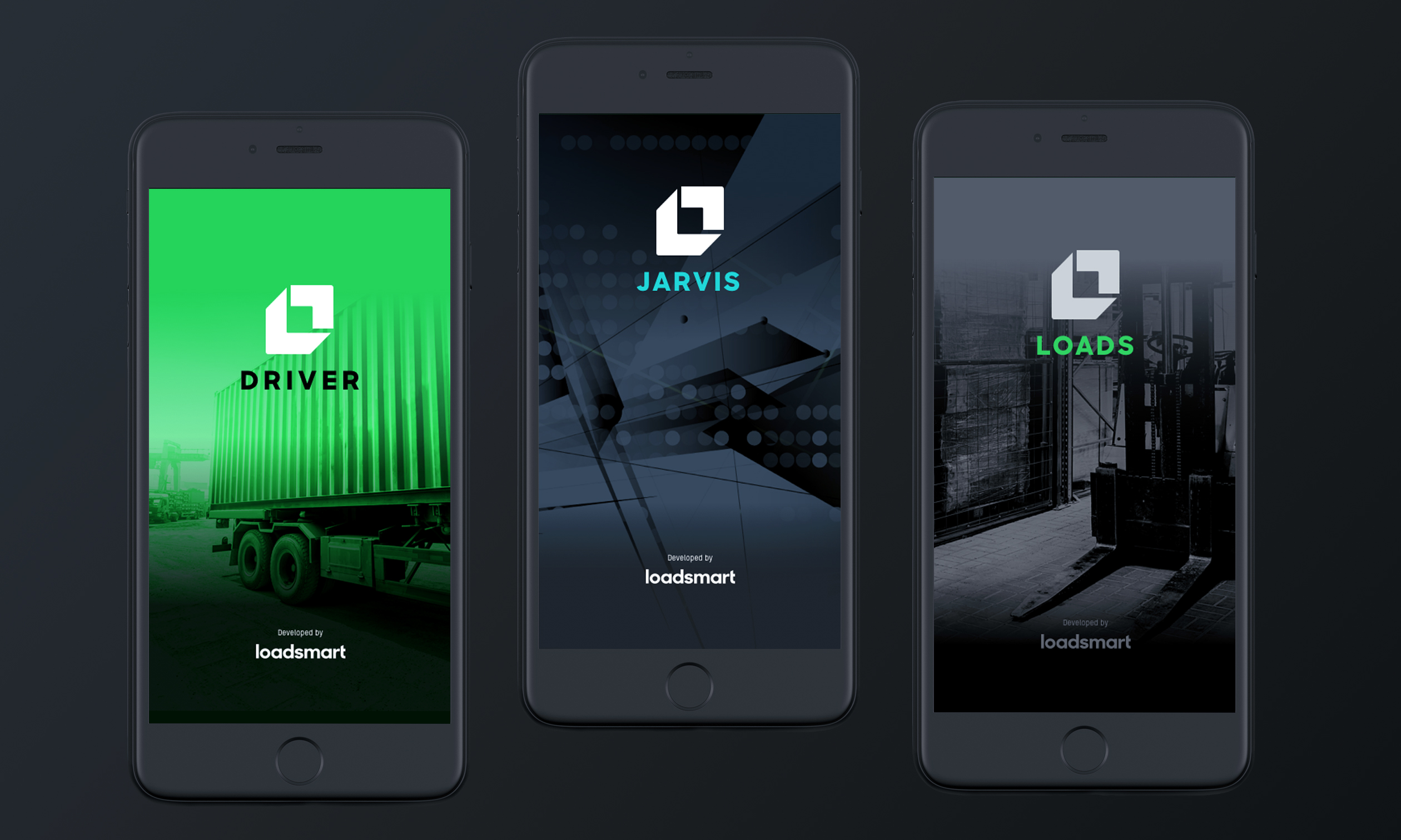
Loadsmart MobileNative app designs for iOS and Android
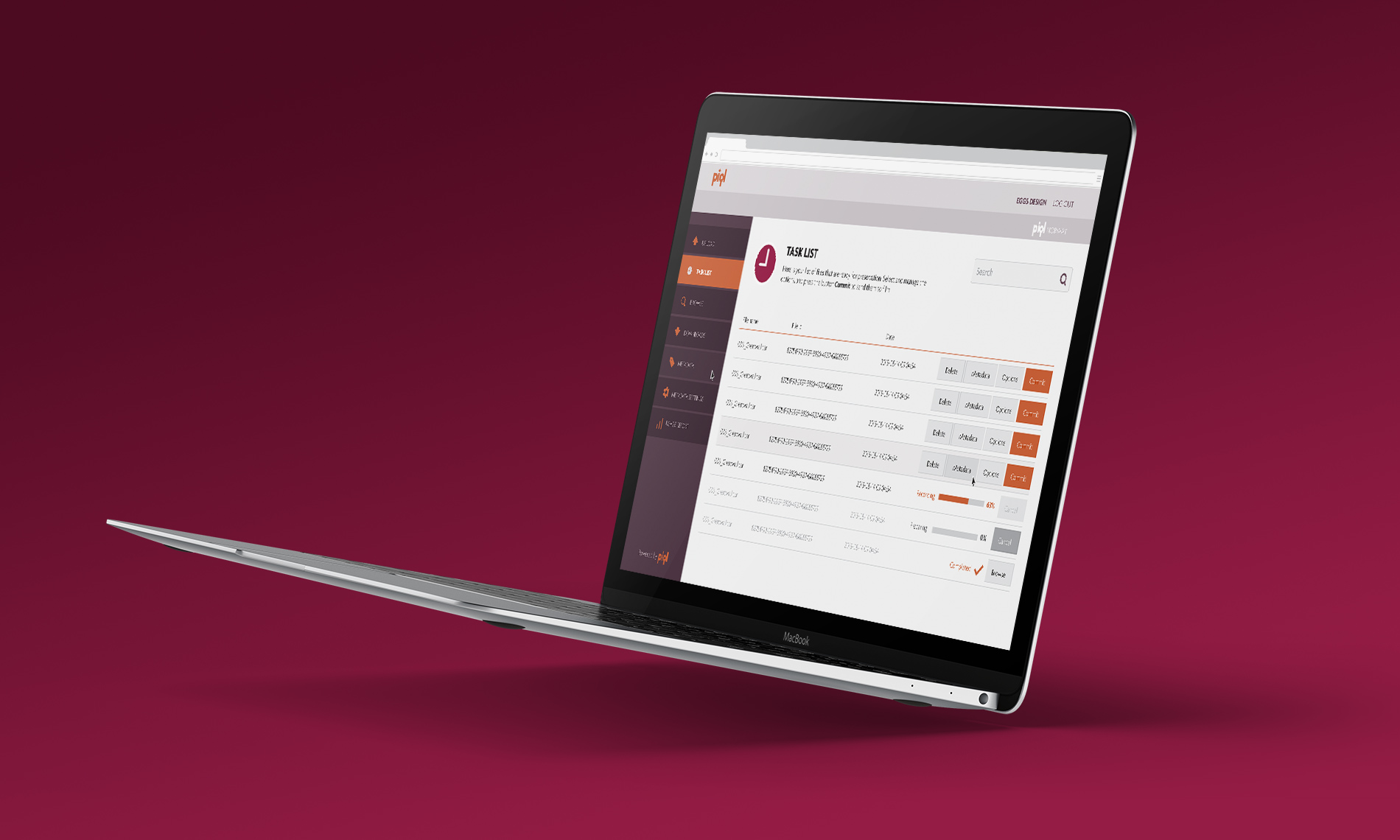
🔓 PiqlPhysical preservation of digital files
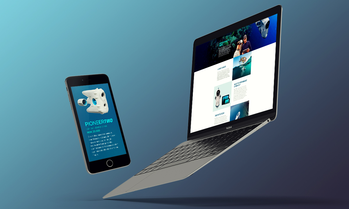
BlueyeThe first consumer underwater drone
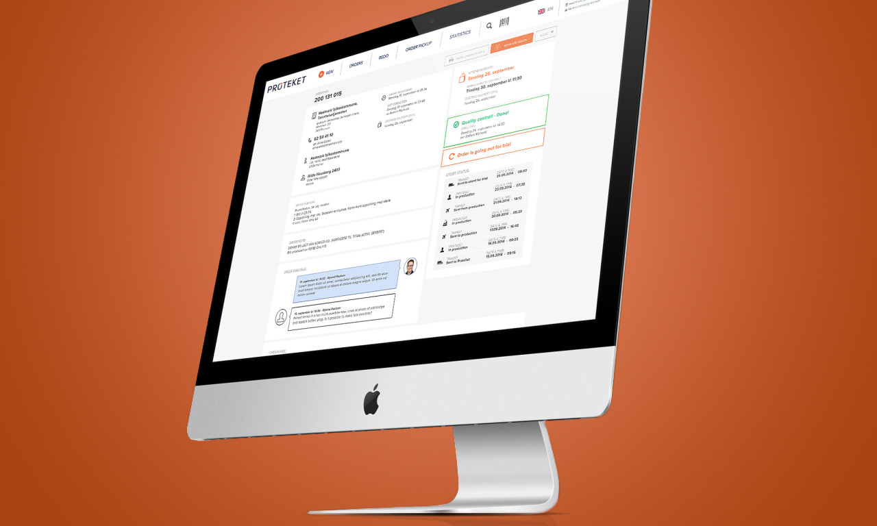
ProteketShop experience for teeth prosthesis
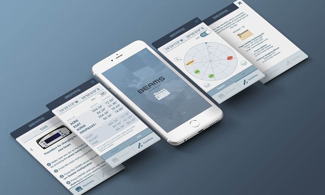
FugroA constellation of satellites on your phone
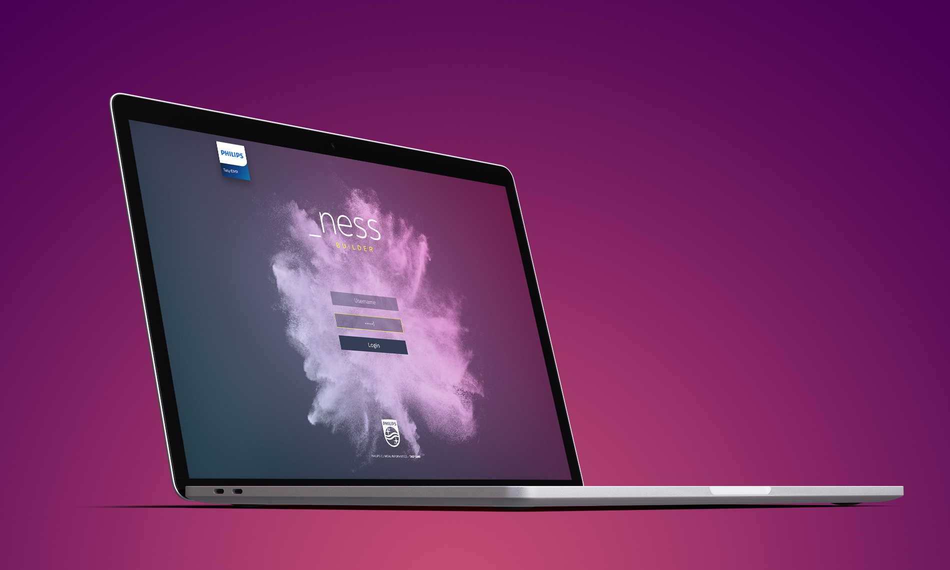
🔓 _nessCustomized branding of an internal UI

Piezo ShowerA self-heating shower
🔓 AppconThe conference of new technologies
© 2018 VICTOR STELMASUK. ALL RIGHTS RESERVED.